

Rules Engine
Role: Lead Product Design
Tools: Figma, FigJam
Challenge
The Anti-Fraud Department has an incredible amount of data to prevent, manage, and proactively prevent customer and employee fraud. The goal of this product was to produce a high-security interface accessible to a wide range of internal users who need to utilize fraud features, models, and data sources to author fraud-related rules that auto-execute. This product required multiple entitlements for various users—given not all rules were allowed to be accessible to just anyone.
The problem:
• Lack of system required many Knowledge transfer sessions for onboarding
• Only rule authors would know how to update or manage an existing rule
• Legacy system was highly inconsistent and did not provide flexibility or clear status visibility
• No system to maintain existing processes and documentation was highly limited
Legacy product
The current solution to author rules utilizes a platform built in 2012 that would execute rules only an a fixed schedule and in a queue. To create any dynamic rulesets that would automatically execute when triggered, each Line of Business would need their own engineering team that are well versed with the Fraud AI data available. The target users for this product are business users (product owners, non-developers) who can author rules independently of a developer.
Legacy rule view and authoring
Legacy rule testing feature (separate application)
Ideation
The major challenge with this product was not only delivering a refresh of the legacy product, but also to expand the authoring capabilities to appeal to more Lines of Business for buy-in. The initial MVP delivery needed to consolidate over 5 different platforms that are currently in use. These examples of ideation strategies and exercises were important to define the product requirements, which were being simultaneously solidified during MVP delivery.
Flows : The high-level requirements miss many of the flow possibilities that lie outside the “happy path”. I created flows to demonstrate to product the rule status lifecycle, and to derive additional requirements from flows that were not considered upon requirement delivery.
Future state : Part of my process almost always includes a future state representation to draw a path for post-MVP requirements. This strategy eliminates re-work in the future and additional buy-in from other Lines of Businesses.
Alternative authoring methods : We consciously consider the future state of the product while building out the MVP. I always provide alternative MVP options to capture certain scenarios that allow current users to have some familiarity with the transition to a new platform.
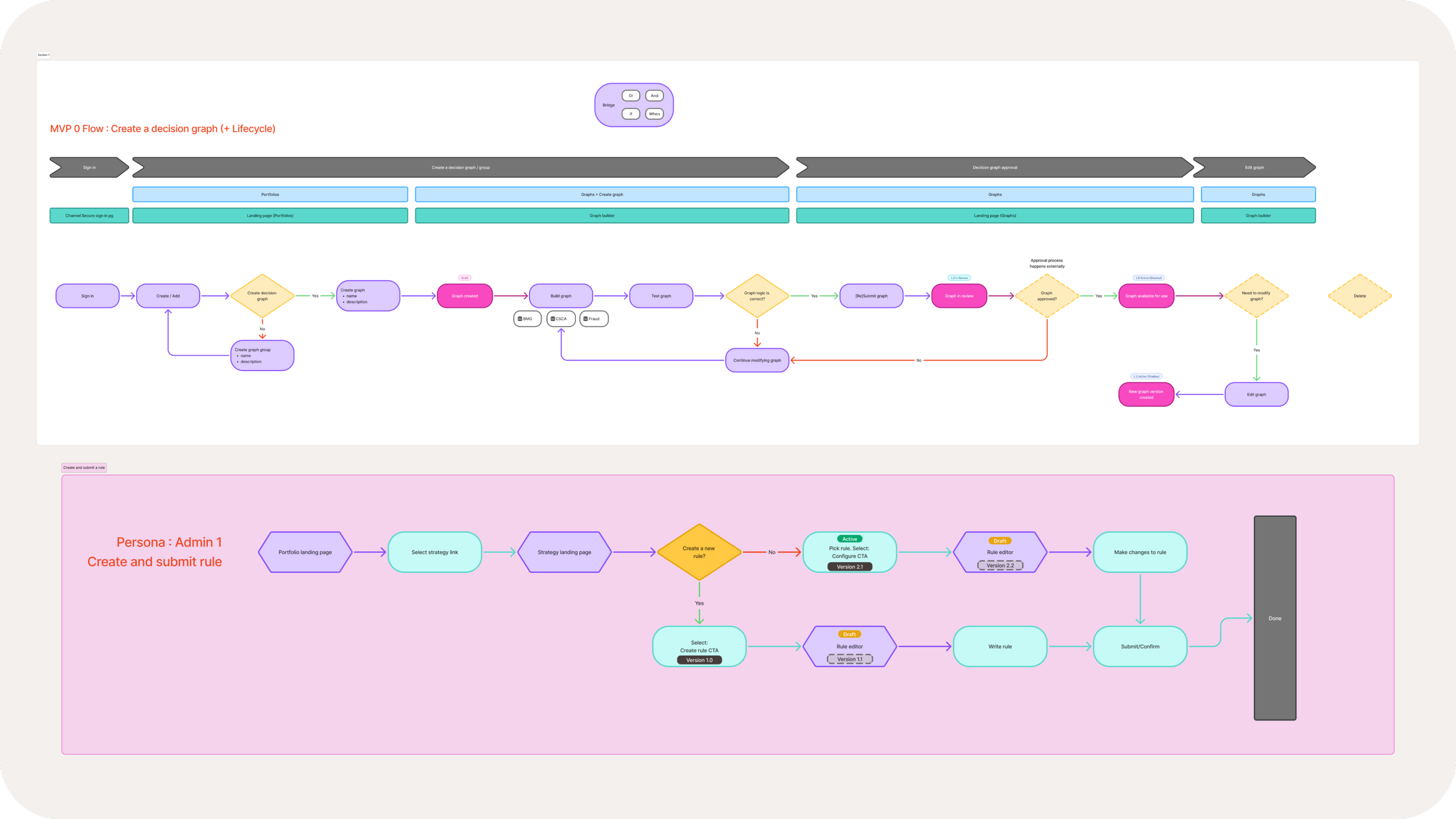
Flows : These flows drive discussions on a flat-level to focus the stakeholders on feature creation (in JIRA), product planning. and validation
Future state of rule authoring - ideation and working session with team
Node builder components
Alternative authoring methods : Working with product to consider alternative authoring methods for MVP—to be expanded upon in the future.
MVP
With an aggressive timeline, this team was able to not only create multiple POCs (proof of concepts), but also deliver within Q1. With this delivery, the product was deployed to PROD with improved features and a brand new interface for our users.
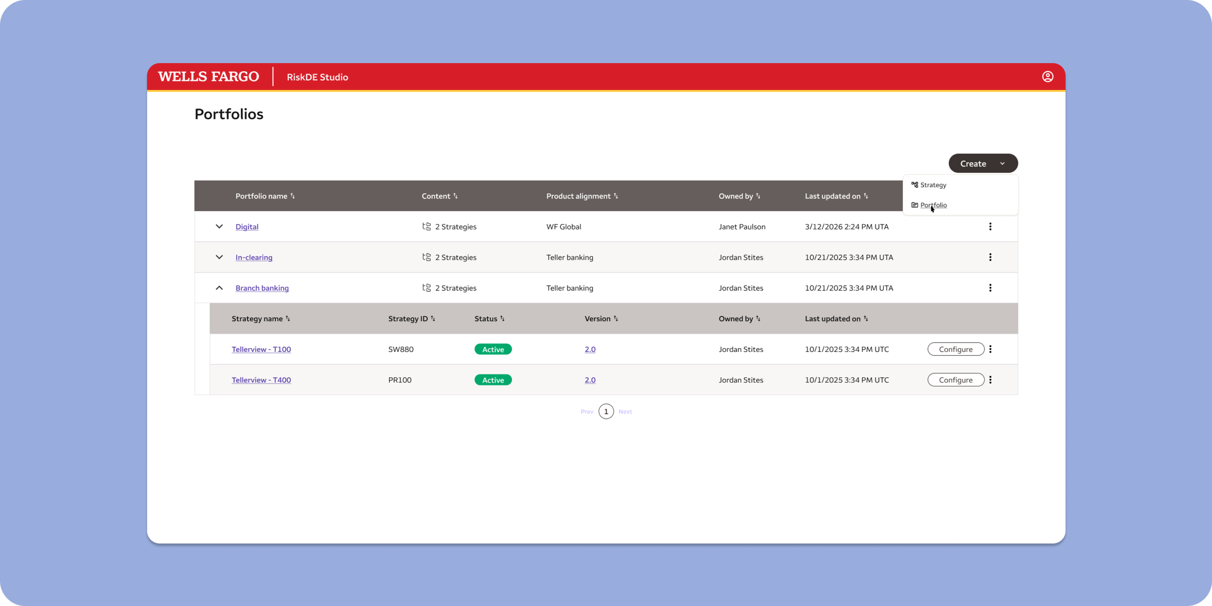
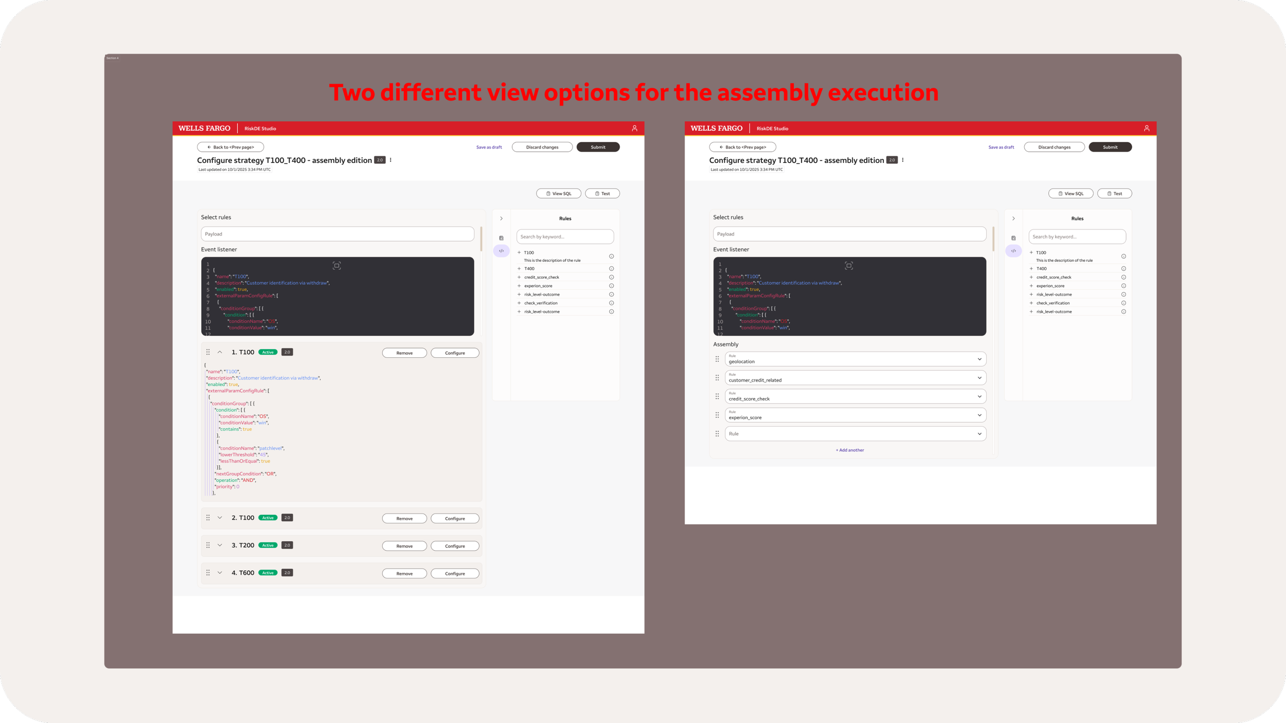
Clear organization and flows to execute tasks
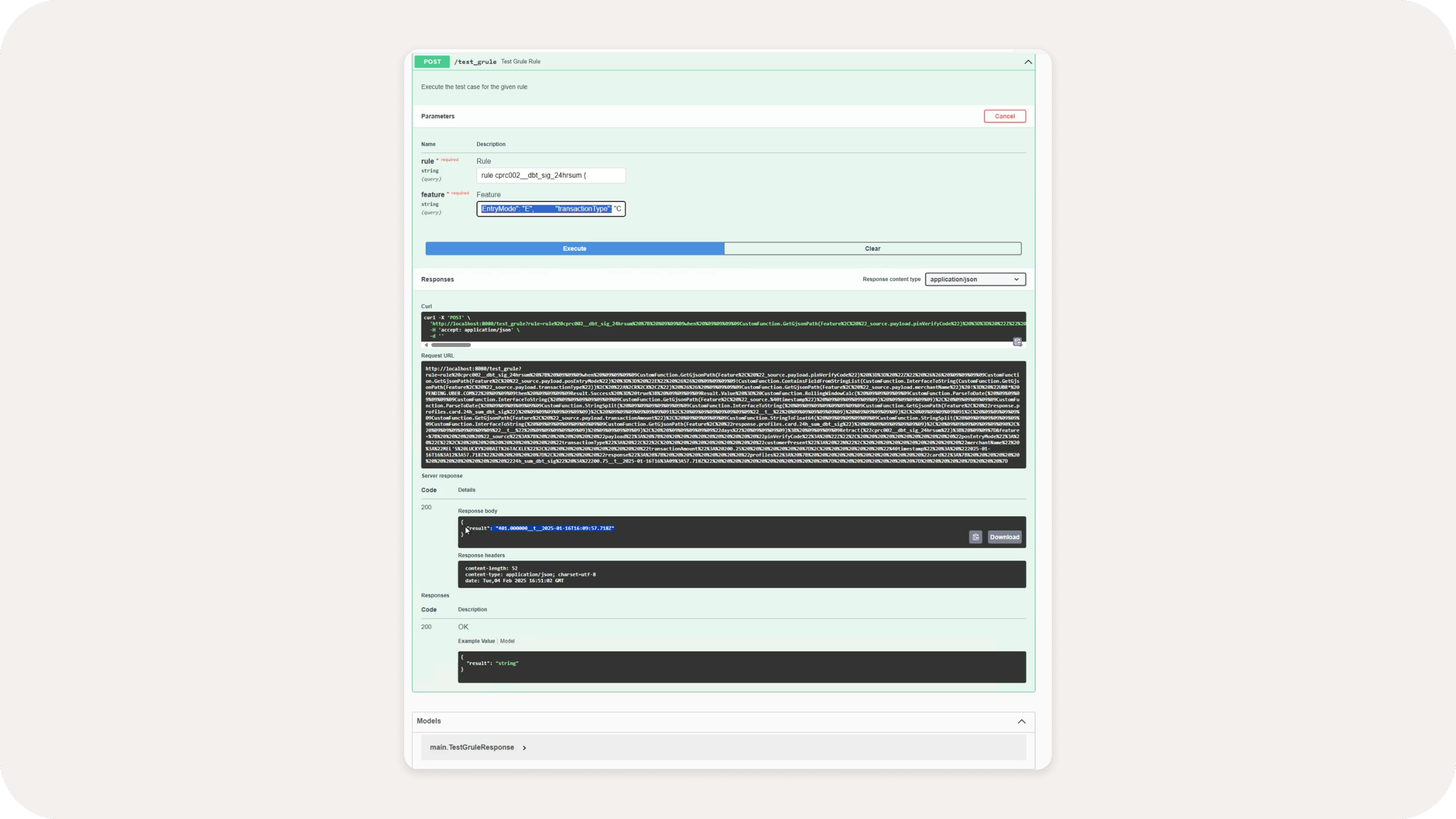
Improved testing capabilities to test rules before publishing to the larger group of employees
Data consolidation and organization to quickly understand the rule function and access all data for that rule.
Version control to be added in the next release; this feature allowed users to revert to a prior version of any rule if needed
Rule details page
Rules version history
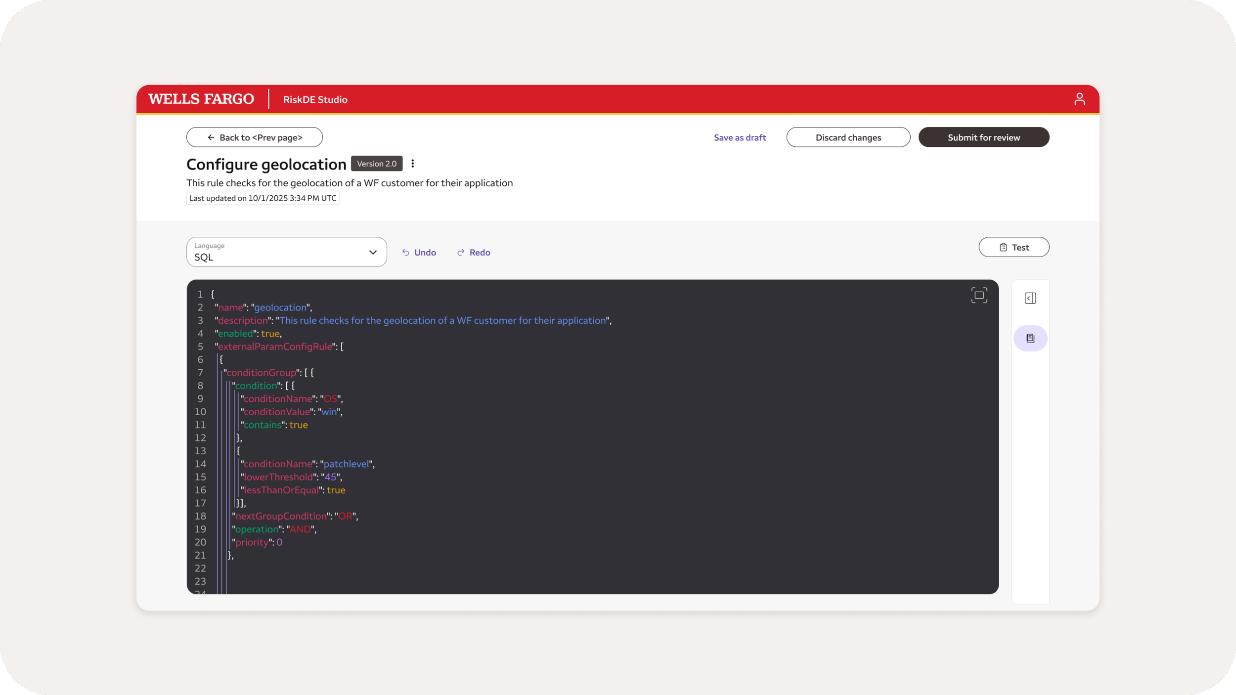
Rule authoring using SQL (MVP)
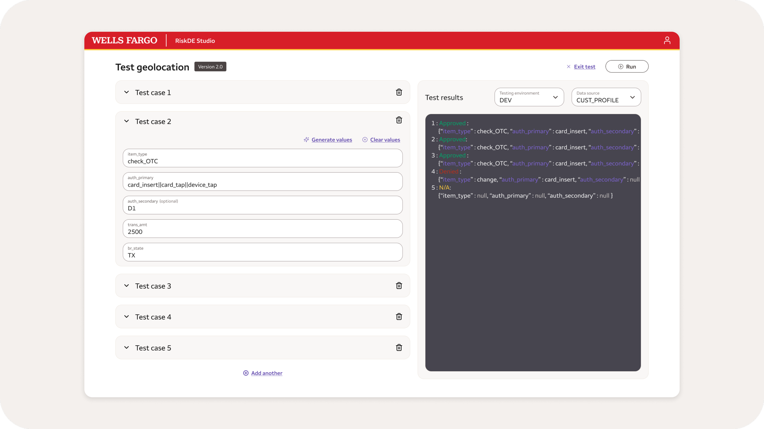
Test rule by creating multiple test cases